The General Consensus’ evolution: a note from the editor
A look into the design process and Journalism classroom.
Dear Reader,
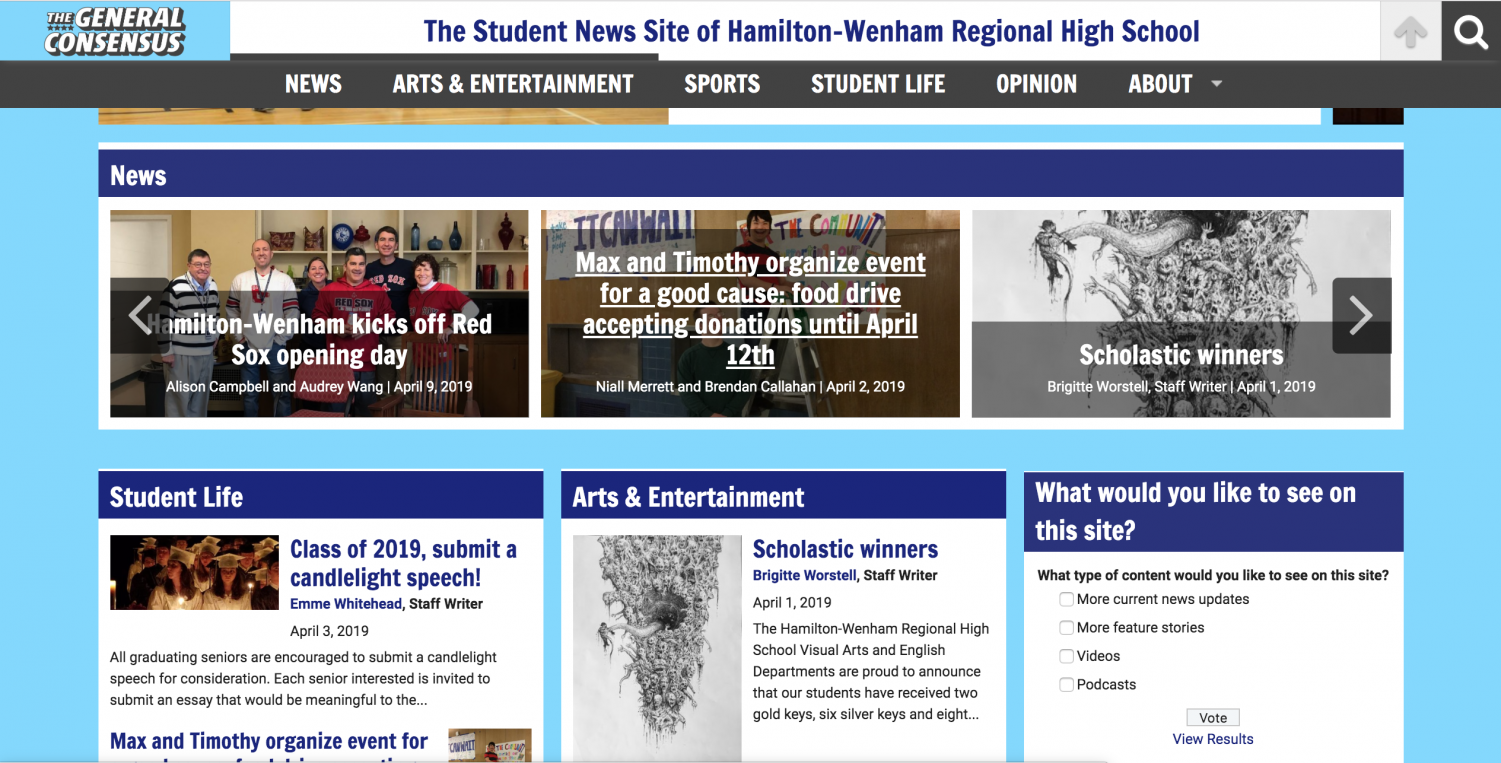
Welcome to The General Consensus, Hamilton-Wenham Regional High School’s student news source. Our staff includes students in Journalism class, outside writers and photographers, and teacher advisor Mr. Hickey. This year, along with creating content and building a team, the newspaper has made its shift to a digital format, and we’ve just released the newest version of our site—you’re experiencing the new design right now.
If you’ve kept up with our newspaper since the fall, you will have noticed our multiple site redesigns. With each change, we have attempted to find the proper balance between featuring content and having visual appeal.
The initial version of the site—the first attempt at forming our newspaper’s new identity—was functional, but not necessarily unique to Hamilton-Wenham. We wanted to create something special to our school to justify the transition to an online format and establish a form of individuality and spirit.
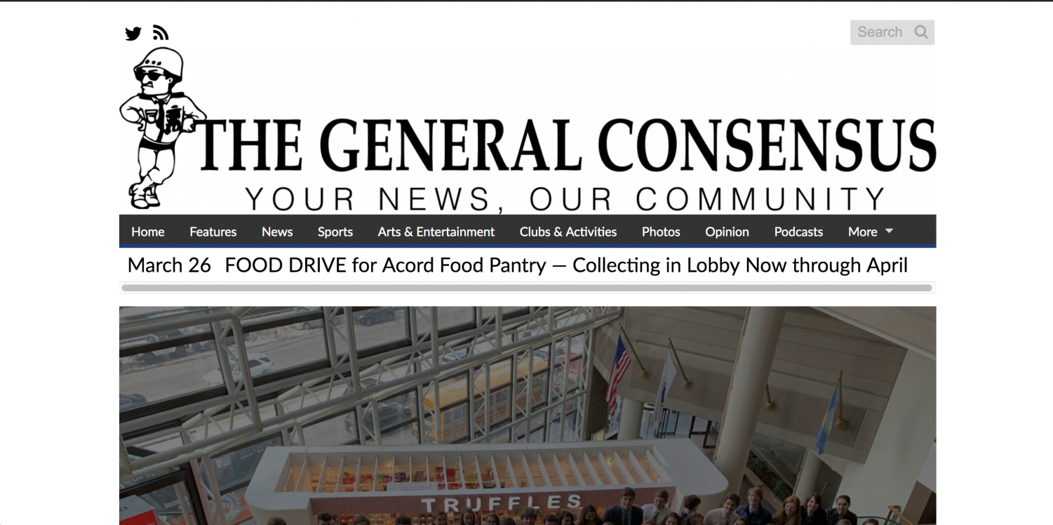
The first edition of The General Consensus online
The first edition of The General Consensus online
The second version of our site inched closer to creating our current brand. The new logo and presence of color breathed a more energetic feel into the site, although a bit underdeveloped and busy-looking. The design was my personal first attempt at adding to the site, after officially joining the newspaper staff in January. The blue shades point to our school district’s colors and the four stars represent a four-star general, our mascot.
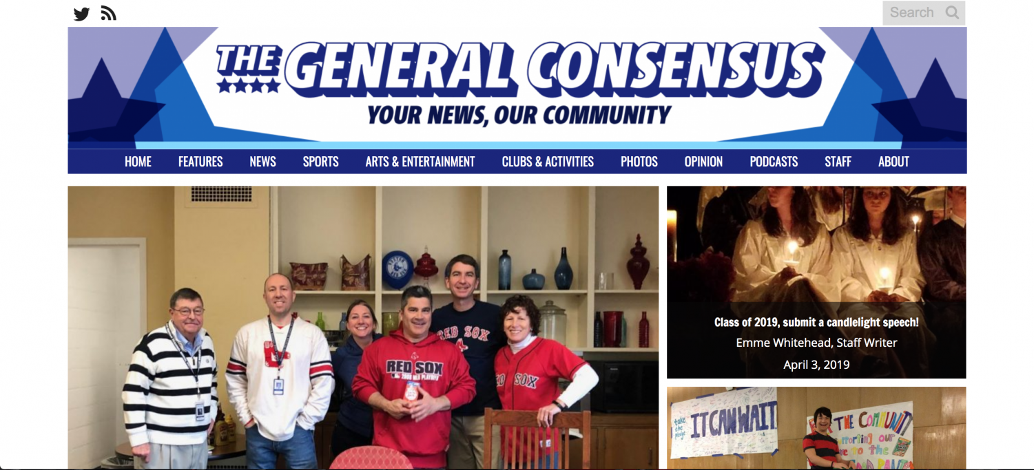
The second design of The General Consensus
The third design of our site was our biggest official redesign, present with the release of Edition #5, the first edition of the second semester. Edition #5 included our most popular articles to date and correlated with updated activity on our Twitter feed. We took the light blue that you saw on the bar underneath the logo in our second design and established it as our signature color.
I wanted The General Consensus to be recognizably Hamilton-Wenham, but unique at the same time. The school district’s color is dark blue, so this lighter shade—dubbed General Sky Blue—is uniquely ours.
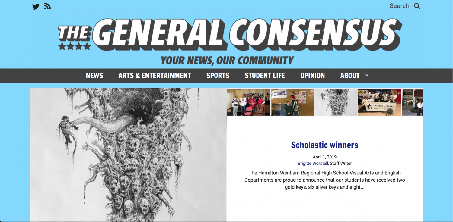
The third design of The General Consensus
The third design of The General Consensus
Although a step in the right direction in terms of recognizability and branding, our entirely sky blue site drew focus away from the content on the site. In addition, the combination of aggressive color scheme and fun fonts did not provide as clean and as professional a look as desired. We now present our current design, in the hopes that it achieves the balance between aesthetically pleasing, content-driven, unique, and professional.
The new design is cleaner and more timeless than previous versions, and will hopefully remain The General Consensus’ identity after I graduate.

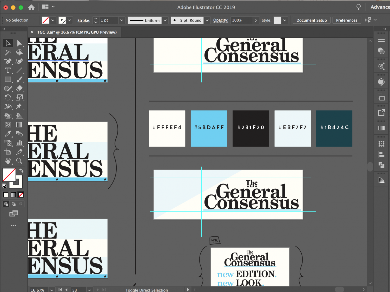
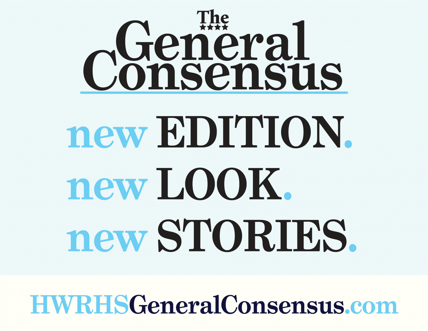
Our new logo
Our new logo still features important aspects like the four stars and General Sky Blue, now in a solid line beneath the text.
I hope the new, clean look of the website is favorable and that you enjoy our new content. To never miss out on a story, be sure to follow us on Twitter and check our website weekly! We truly appreciate your readership and are open any feedback you may have.
Leave a comment below, submit a story idea under the “about” menu tab, or keep reading stories!
Enjoy,
Brendan Callahan
Editor-In-Chief
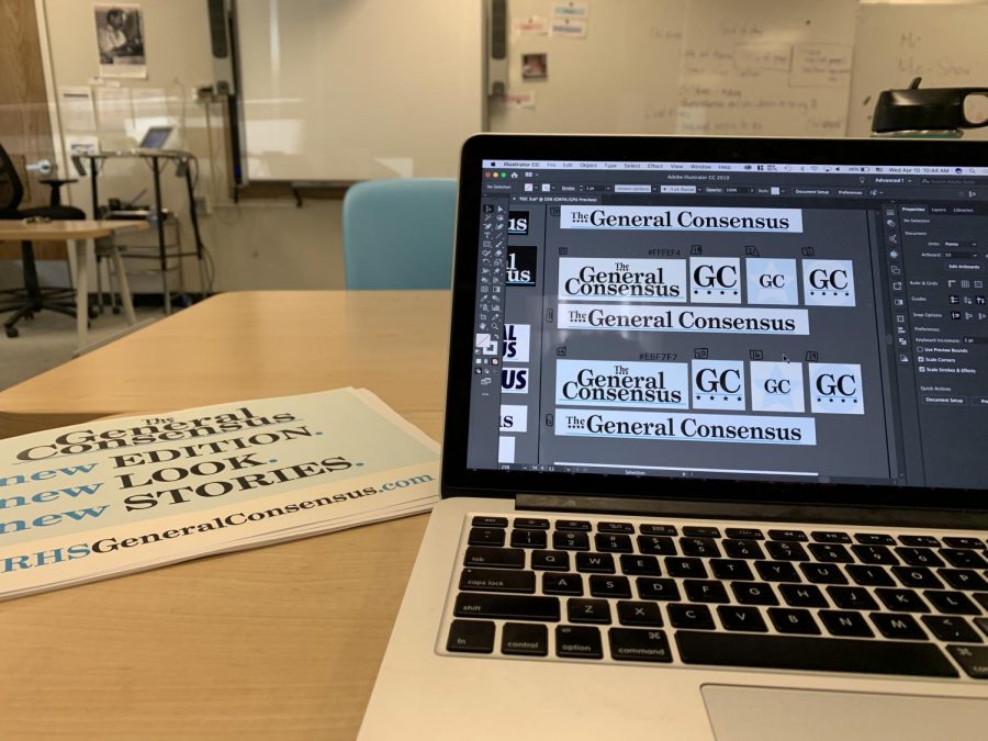
a look into the logo design process
A look into the logo design process

Brendan Callahan, a senior at HWRHS, is excited to be creating content for The General Consensus and progressing the design of the site. At school, Brendan...